Typography Project 2
17/05/2019 - 31/05/2019 (Week 7 - Week 9)
Daisya Putri Suherman (0334394)
Typography
Project 2 : Font Design
LECTURE NOTES
Lecture 7 : Text tracing, Kerning, Letter spacing
17/05/2019
INSTRUCTIONS
Exercises
Week 7
Project two starts by selecting one of the 9 font types that Mr. Vinod give then we dissect it and decree the alphabet we choose. I chose the futura std bold font.


Daisya Putri Suherman (0334394)
Typography
Project 2 : Font Design
LECTURE NOTES
Lecture 7 : Text tracing, Kerning, Letter spacing
17/05/2019
This week Mr.Vinod explained about project 2 which we have to re-create fonts from existing fonts with our own version. Before we made the font, Mr. Vincent taught us how to analyze fonts using line and round tools.
Lecture 8 : No Lecture
24/05/2019
24/05/2019
No Lecture
Lecture 9 :
31/05/2019
Today Mr.Vinod briefly describes a number of errors that often occur in typography and also about highlighting a word or sentence by changing the type of font to be different from the others, changing the color of font, making backround the color of font, or by bullets
31/05/2019
Today Mr.Vinod briefly describes a number of errors that often occur in typography and also about highlighting a word or sentence by changing the type of font to be different from the others, changing the color of font, making backround the color of font, or by bullets
Exercises
Week 7
Project two starts by selecting one of the 9 font types that Mr. Vinod give then we dissect it and decree the alphabet we choose. I chose the futura std bold font.

figure 1.1 : Letter e dissection and decontruction

figure 1. 2 : Letter a dissection and deconstruction

figure 1.3 : Letter u dissection and deconstruction

figure 1.4 : Letter d dissection and deconstruction
After getting an overview of the results of dissecting letters, Mr. Vinod asks to make the font recreate with our own work
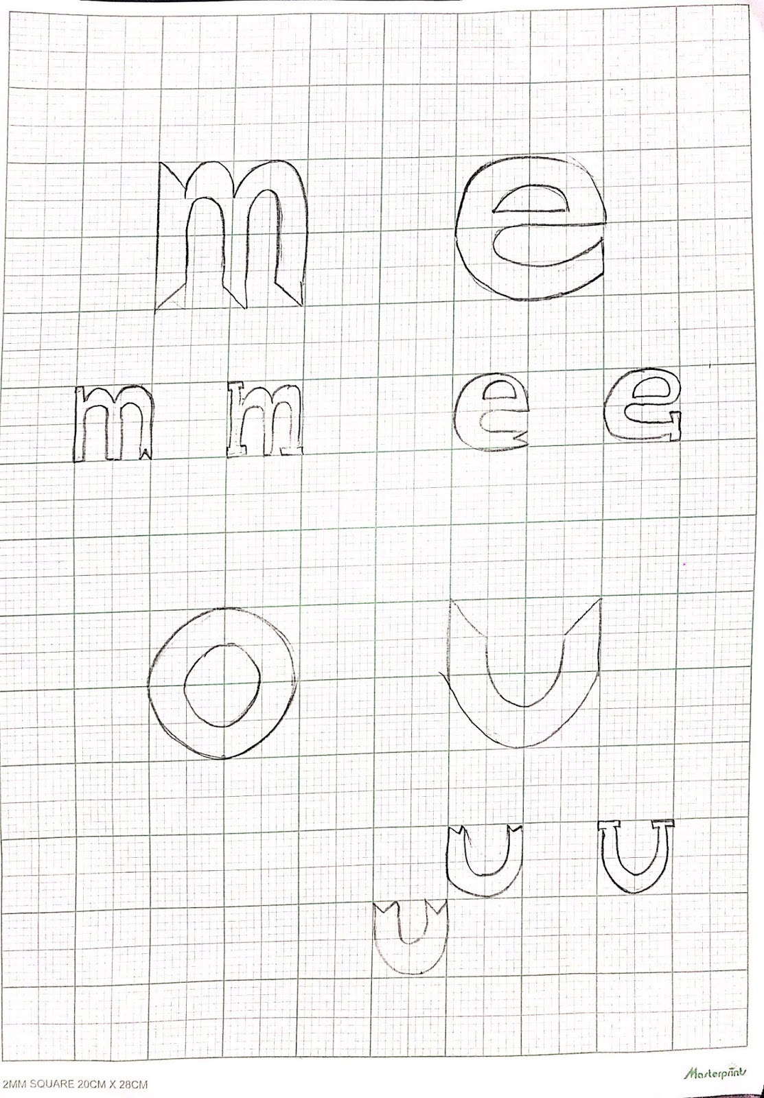
figure 1.5 : skecth for project 2

figure 1.6 : skecth for project 2

figure 1.7 : skecth for project 2

figure 1.8 : sketch project 2
Week 8
This week we moved the results of our sketch to digital form.

figure 2.1 : first attempt of digitized font design
Week 9
This week Mr. Vinod asked us to move our work to a fontlab application and after being a font we were asked to write a sentence "i survived mr.vinod and mr.sam's class."

figure 3.1 : progress fontlab

figure 3.2 : final project 2
figure 3. 3 : final pdf project 2
figure 3.4 : final font project 2
Feedback
Week 7
This week for the second project Mr.Samsul told me to make an asscender and descender line so that everything is the same.
Week 8
Mr.Vinod saw the sketch that i made in digital and said that my font was not soft and need to fix it and Mr. shamsul give me a feedback that my font was too thick and not consistent
Week 9
I still have to fix a few fonts and Mr. Shamsul helped me to make soft and consistent fonts.
Reflection
Experience
Week 7
At first I did not understand what i haveto do and i just did what Mr. Vinod explained. Then finally after a while i did dissection and decontruction on the font i understood the purpose of this exercise
Week 8
I ran out of ideas and was confused about how to re-create a new font from an existing font. I have some sketch that are so basic
Week 9
This week I was very troubled because I could not install the fontlab application which made me have to go back and forth to the browser and contact some of my friends to request the application. unfortunately I got a cracking application that ca not be opened on my laptop.
Finding
Week 7
Making sketches first really helps to make fonts
Week 8
I realize that if we make things incorrectly in Ai it will make things worse, even have to repeat, and must be careful to look good.
Week 9
I am happy because I can make my own font with Ai and fontlab but I am still a little confused using fontlab
Observed
Week 7
I saw all my friends in class so focused on working on dissection and decontruction
Week 8
my friends and I are also very stressed because I have to be careful and careful to make fonts
Week 9
some of my friends look happy because the work is done
Further Reading

figure 4.1 : cover book
The book is possibly the only early treatise on typography designed for practical use, not theoretical debate. The book's examples are the normal stock-in trade of any printer or designer, letterheads, business cards, posters, all rendered in standard sans-serif fonts . The "before and after" format shows you just how radical a change he proposed, and his examples would still be perfectly usable 80 years later.

Comments
Post a Comment